Monday, May 31, 2010

Postcolonialism

An artist that I have discoverd was Kara Walker, who is a contemporary artist deals with physical,emotional,personal,racial,historical and sexual.And I think she is a prefect artist to relate to Post-colonialism.
She uses silhoutte illustration which is similar to the pre-mickey mouse cartoons. And the images in her works are mostly monotone(black with a simple white background) which could also relate to her African American heritage, because of the stereotype imagery that Post-colonial settlers used to provide visual stimulus for those in Britain and part of Europe.
For example in this work:


I can see that the little girl is in black who looks like shes crying is surrounded by a white colour.This could represent the Africian being slave in America.This work had made me realise that although she has no texts or words in her works,she could explain the message that she wants to deliver to the viewers clearly by some simple techniques and this is what successful about this artist.

Wednesday, May 19, 2010

In the last lecture on Tuesday,I actually enjoyed since I'm quite interested in advertising and also the images from the list attracted me so much ,especially the obey ones! Cause I actually like this brand and I was actually going to wear a shirt of Obey from that day! haha

Anyways,this week we are told to write about some advertisement, so I was thinking about some brands that I know and started to look at their ads. I have discovered nike, addias, puma,emerica,obey,famous stars and straps etc. And I think the most successful and the ones who last in my mind for the longest period of time are the ones from nike.
Before I actually look at ads from Nike I researched about Nike's origins and history in order to get a better understand of the works. From my researching, I realised that Nike was originally called Blue Ribbon Sports. After the first soccer shoes "Nike" was sold, it renamed itself to "Nike" which means the Greek goddess of victory.
After I knew about the meaning about this name, I think it was actually a really good start for them, because people sent millions and millions to get a good name for a brand and Nike actually got it, this was a really good start for them and their further development and advertising as well.


This is one of the favourtie Nike ads that I have discovered, the tick logo itself really fits the meaning of Nike, the Greek goddess of victory because tick has sucha positive meaning. The using of colors and the background was really really well.The tick is in a very bright color which stands out of the dark background, and its like saying it is the only sportwear that I could possibly found. Also, since the products of nike are all about sports, therefore the fire form of the tick really fits the products,cause sports and fire are all about energy and power as well.So I think that's a good ad in my opinion.


Another image that I discovered which is think is the most successful is this one. It might looks abit funny but when actually thought about whats going on is a whole different story.
The place that is in the image is sure in a really poor place.What the child was doing was doing was not good but it does really fits the slogan "Just Do It". And this is like sports as well, what sports do is to break the boundary,there is no tricks, you just got to practise, you JUST got to DO IT. Also the effect on the Nike logo looks really old and its like a part of the wall, its sort of like saying to me that Nike and sports are also possible to be appear in poor counrties which makes this ad more worldwide and kind of aims at everyone to me. This is a really good ad in my opinion

Friday, May 14, 2010

From the list of lots of artists from last lecture,there is an artist that I'm always interested in and who is from my favorite kind of art, who is Andy Warhol.The work from this artist are everywhere and popular, the colors of them catch my eyes a lot.But I don't know really well about him actually,eg. like his way of working,subject matter etc. Therefore, I would understand him more and in order to find an artist who related his his works.And I reckon in order to do so, is to start looking at his works.


The few images above were some more popular works of Warhols( in my opinion), I think they are amazing. The way that Warhol works was screen printing and uses of paint as well.In this way of working, he was able make lots of copy of one image and put different crazy combination of colors on them, and I think this encourge him to do so. Also, because of how easy to make an image on the work, you could often see his works are with like thousand of a same image repeating and repeating all over again. This also what pop art does, its like heaps of images coming to you. The subject matter of Warhols works are obvious,its about popular culture or like things around us eg. micky mouse,campbell soup etc. And the works of these images are so straight forward, the message is coming straight to you.

The artist that I could think about that could compare to Warhol is Rosenquist (I know I talked about him a lot already haha, but they are really related in my opinion).
Although their way of working are not too similar since Warhol was using more of screen printing and Rosenquist was more like a painter, their subject matter was really similar or even the same. They both use the subject matter of popular culture like people(artists,prisdent), objects(cars,food) and they both used Marilyn Monroe as a subject matter as well haha.
Also, the colours of their works are colourful which grab people attention really well. The method of repeating images is not often use in rosenquist works but i could find one?


but i think this is not as successful as Warhols works cause i reckon the unreal colors that had been used in his works are easier to get peoples' attention.
And these are the opinion of mine on how their works are related to each others.

Tuesday, May 4, 2010

Star Wars

First of all,i would like to say I'm a big fan of Star Wars and I watched most of the movies of it except the one that we watched yesterday and the one after it i guess. So it was the first time I saw "A New Hope" and it was really good.

The character I focus the most was actually the Lord Darth Vader. In my point of view, I reckon he is the whole point of the movie cause he was sucha important character. In the movie we saw yesterday,he didn't talk much. Every time he appears on the screen was about destroying and killing people. So he looked like fully bad person.

Well, I really could think of any characters from another movie to relate to him. But I just love this character so much,so I'm going to continue talking about him and how he had became Darth Vader.
Darth Vader was known as Anakin Skywalker who was a Jedi and the chosen one. But he started to listen to the Darth Sidious since he wanted to save Padmé who was his wife. Anakin fell to the dark side. Before he turned into Darth Vader, he had a final battle with his own master Obi-Wan.
This is also one of the favorite battles of mine in Star Wars.


As you can see from the video,Obi-Wan had cut his legs off and left him burn to die.But Darth Sidious had saved him and made him become Darth Vader, the scene that the mask put onto Anakin and he started breathing was so cool! haha
From what I have seen from the last movie of Star Wars, Anakin/Darth Vader saved his son Luke Skywalker from dangerous and killed Darth Silious. I could clearly see that even though he joined to the dark side, he was a good person by saving his son. And even when he follow Darth Sildious, he was trying to get him to save his wife Padmé.
And this is how this character attracts me and how important he was because he was the main character that links up the whole 7 movies together.

Monday, April 26, 2010

Auckland War Memorial Museum Visit

On the lecture today,we went to the Auckland War Memorial Museum.
The whole museum was seperated into parts,each section is introducing different cultural group,different things like animals,insects etc. They were all amazing and discussing each idea in details.But the most interesting section to me was the one about musical instruments.
Here is some photos I took in that section:


The reason why I'm into this section more is because I love instruments and especially the ones that are made of wood. So when I went to this section I was like oh my god haha.
The whole sections included many kinds of instruments,but the ones that I digged more were the chinese ones which are shown at the photos above.
They displayed quite a few of chinese instruments,they are included: trumpet, sanxian, yueqin, lo, sheng, sana, pili and yangqin. Most of them are made out of wood, copper , brass, bamboo. Some of them even made of snakeskin and gut.This makes them look really causal to me,unlike the instruments that are in golden or made by metal. And obviously people use them for making music and melody.

I found these objects really attractive because I'm a big fan of things which are made of wood and look old. In the old days, the people who could play these instruments (especially the last photo) are mostly girls and the ones who are well eduacted.It was because in the old china, familes who were poor, they made their son or daughter to work which means they had no time on instruments or any other hobbies, and they didnt have the right to do or say anything for themselves, they just had to do whatever their parents told them to.

The objects are displayed in a glass box and I reckon it's a really boring way to do it. The lighting of the whole room was pretty dark as well and it was silent. If I had a chance to organise this room again, I would at least put some music on because it is a section about instruments, how could it be without music! right?! Other then that, I reckon for each section should provide photos or videos of people playing them.For example, the chinese section should provide videos of chinese ladies playing either of the instruments, from that people not only understand how the instruments ,but how the chinese people from the old days dress and they could know about more about the cultural as well.

Thursday, April 1, 2010

Visiting Auckland Art Gallery

On the short trip to Auckland Art Gallery on Tuesday,I have seen some pretty interesting artworks there and the one which impressed me the most was the big black cloud made with microphones. That was a massive work in a gallery and I reckon it looks scary to me. haha
But I think it isn't the best work that links to risk and adventure.
One of the artworks in the gallery that I found it fits to these two terms was the one that made of different parts of a car. The car was smashed into different pieces and lying down on the floor so it formed a nice shape. The reason why is because car is a transport which could brings you to anywhere you want, while you are in a car, its like taking an adventure and taking a risk as well,

The other one that I saw was the one called "Room with a Bird"
It fits the theme so much because it looks like there was a bird which was stuck in the room
and its trying to escape,the things that was hanging from the walls makes the bird like flying around the room. The artist left a window on the wall in order to make the viewers think that the bird is not at a closed room, and it had a chance to escape,to take risk and has its adventure.

These are what I think about the show and I know I might misunderstand the meaning of risk and adventure lol,but yeaaa

Tuesday, March 23, 2010

Further Response on Feminist Artist - Barbara Kruger

As we were going through the whole slide list today, the work "Your Gaze Hits the Side of My Face" by the feminist artist Barbara Kruger immediately stood out to me from the rest of the works.


The reason why is because I found the way that the artist works on this piece of work is similar to the artist that I love-James Rosenquist(yea,Pop Art again haha)
I found that they both like to use really large scale of a part of an object on their work,
in this way of working,it makes the work catches peoples' eye and it's like bringing people the message straight away,because people don't need take ages to search for the important parts on the works,which also gives their works to have a great quality to be on billboards as well.

Although I can tell these both artists are similar,
I'm not meaning that Barbara Kruger doesn't have her own elements in her works.
I have found a couple works of her.....


As I mentioned before,her works are mostly structured by huge images,
but i think there are some more things which makes her works really strong images.
The texts on her works are bold, big and in red color,
and I think that is really effective since she had done that.
The using of color of the texts had made the statement on the works as the subjects on the works, and the statements are overlapped on the objects.
The using of color of the objects are in black and white,so that the statements really stands out from the background and this also makes the objects underneath are like supporting the messages that she wants to give us .

As some research that I have done...

"Kruger's words and pictures have been displayed in both galleries and public spaces, as well as framed and unframed photographs, posters, postcards, t-shirts, electronic signboards, billboards and on a train station platform in Strasbourg, France...." from Wikipedia

This also really helps when her works are put up on the billboards,because people could see what's the poster trying to tell them easily,clearly and quickly since the people nowadays are really busy and rushing all the time

Wednesday, March 17, 2010

Unpacking My Library

From the lecture and gallery visiting on Tuesday,
I have discovered another way of making art works which is about the using of texts.
It is powerful and effective, which I can tell from Daniel Malone's work
(Black Market Next To My Name)


Actually I had discovered the idea of using of texts in art works quite a few years ago as I was looking at different pop artists like James Rosenquist who i had mentioned at last week. haha
But the using of texts is a bit different from how Daniel Malone does it,
it's more like supporting the objects or images from the work,
and that's what I thought how texts should be used in art work and
I used to have a feeling that art works should be something related to painting..drawing...objects etc.
But after I have seen of the work from Daniel,I knew that texts could be used as the main elements in the artwork.
-With the using of colours (black writing on white walls)
-Hand Writing
and the scale of the work is just amazing and it really catches viewers attention and expression messages that Daniel wants to tell us.

As I was listening you (Tessa) haha talking about more of his works,
I found the one of he did the chinese logo on the glass really funny
And it interests me cause actually im chinese, I want to know what's about that work
and see how it looks.


After I have seen this, I think it's inspiring!haha
Because this is something that would never consider to use in "art work" til i see this
This is really interesting and outstanding because of what this logo means and the using of its colour.
Also, I have found that working in this way is simple and quickly,
therefore we are allowed to making a big range of works and experiment more,
and discover what works the best in order to express the idea,

These are response and things i learn from the lecture and gallery visiting on Tuesday.

Wednesday, March 10, 2010

Ten Good Things by Justin Paton and My Top Five

"Ten Good Reasons" by Justin Paton is an article which is about the good reasons on his favorite art works. It's had been broken down into ten different paragraphs, and each of them is about a single art ork.And his way in writing this article is great. It is because when talking about their top art works, people or even me often only focus on the visual things.But Justin Paton took a few more steps than us in order to let us to understand why they are his "top ten".
In order to achieve this he talked about:

1. What preparation works that the artists had done before actually working on the work.

In one of his favorite "House and Outhouse, Purbeck" by Frances Hodgkins, it was a quite a difficult piece of work to understand."She paints it from the inside, digging like an archaeologist into the layers of the place..." But Justin had told us how the artist had started off her work which helps us to understand more about the process behind the work and also to admire how much research that the artist had done to actually start on working the art work. In addition, this also inspires me to do more research before i work, because I understand that that is the key to really make your work an successful piece.

2.Different techniques that had been used.

In the same work by Frances Hodgkins, "fat drags,blunt dabs, multicolored mottlings...."
Justin had motioned all the different techniques that had been used in the painting. I think that is like clues or main points to help us to understand what message is the artist trying to tell us through the painting.By knowing the different techniques, we could easily search them on the painting and seriously think about what is each one of them is trying to tell us.

After reading and viewing the articles and the photos of his top ten artworks, I am okay with his choices and they are wonderful pieces of works.
I think Justin wrote this article wasn't to inspire us to agree with his choices,His intention of writing this article had metioned once on this article,

"Every painting tells a story about its own making"

With the top ten of his,they aren't about how amazing techniques and skills the artists have,
But its about how much work that the artists done before they started working because they want to tell us different ideas clearly in the final product.
This helps me when im doing any kind of art in the future,I would consider more about what im actually going to tell through this work?In order to do so, what research and peparation works i need to do to achieve?
In conclusion, this article inspires people to think more before they work on an art work.


My Top Five


Since I'm a big fan of pop art, most of my top five are from this style of working.

1.James Rosenquist, Volenteer, 1964


Since the title of the art work is "Volunteer", so i have a simple idea about whats going on in this work.I would guess its about promoting an event which needs volunteer.
When i look at this painting closely, I discovered that there are things to brings out the idea of wanting for volunteers. This tells from use of negative space of the big hand and the missing puzzles. It is like tell you that you are the one who are missing in this event or the missing puzzle,if you could involve in this event, the whole thing would be perfect.
Also, the colors of this work catches my attention because they are bright and warm. Which is also the most common thing in working from pop art artist because their works are mostly advertising something. And I like this work because of his techniques to brings out the ideas of the painting.

2.James Rosenquist, F-111, 1965


This is another favourite piece of mine because the techniques had been used in order to advertise something. James Rosenquist as a billboard painter, he works in large scale and his works need to be catching peoples' attetion, in order to do so, he had broken down this piece of painting into many different parts with different bright colors in, so you could easily notice this work no matter when you are driving or walking.Also the careful painting skills impress people as well which helps people memorize whats this painting/advertisement is like.

3.James Rosenquist,I Love You With My Ford,1961


This is an interesting piece that I have found from James Rosenquist. The title is "I Love You With My Ford", obviously the Ford and "You" are the main object in this painting, but he had made these two images into black and white, but the spaghetti is really bright and warm color which makes this image the most important thing. This really makes me curious about what is James Rosenquist trying to say from this work of him.

4. James Rosenquist, Marilyn Monroe


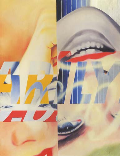
This is another piece that I really like from James Rosenquist. Obviously, this piece about Marilyn Monroe and I really like the way he presented this famous actress. He had broken down the painting into four different parts, and each par includes a really big close up from Marilyn Monroe's eyes, nose, mouth and hand. With different texts of writing Marilyn Monroe (which are in different background and colors as well) in the middle, they made this is art work looks way more exciting than with just painting a Marilyn Monroe's portrait on

5. Robert Rauschenbergs, Combines(1953-1964)


This work interests me because of its mixing of materials. It includes an object in the middle and a painting underneath it. There are paints on the sheep(the object) which creates an effect that it seems there is a relationship between the painting and the sheep. And viewers need to find out their own answers with the images, colours that had used in the painting. This makes me think this is an interesting piece which inspire people to think whats more behind this art work.