"Ten Good Reasons" by Justin Paton is an article which is about the good reasons on his favorite art works. It's had been broken down into ten different paragraphs, and each of them is about a single art ork.And his way in writing this article is great. It is because when talking about their top art works, people or even me often only focus on the visual things.But Justin Paton took a few more steps than us in order to let us to understand why they are his "top ten".
In order to achieve this he talked about:
1. What preparation works that the artists had done before actually working on the work.In one of his favorite "House and Outhouse, Purbeck" by Frances Hodgkins, it was a quite a difficult piece of work to understand."She paints it from the inside, digging like an archaeologist into the layers of the place..." But Justin had told us how the artist had started off her work which helps us to understand more about the process behind the work and also to admire how much research that the artist had done to actually start on working the art work. In addition, this also inspires me to do more research before i work, because I understand that that is the key to really make your work an successful piece.
2.Different techniques that had been used.In the same work by Frances Hodgkins, "fat drags,blunt dabs, multicolored mottlings...."
Justin had motioned all the different techniques that had been used in the painting. I think that is like clues or main points to help us to understand what message is the artist trying to tell us through the painting.By knowing the different techniques, we could easily search them on the painting and seriously think about what is each one of them is trying to tell us.
After reading and viewing the articles and the photos of his top ten artworks, I am okay with his choices and they are wonderful pieces of works.
I think Justin wrote this article wasn't to inspire us to agree with his choices,His intention of writing this article had metioned once on this article,
"Every painting tells a story about its own making"With the top ten of his,they aren't about how amazing techniques and skills the artists have,
But its about how much work that the artists done before they started working because they want to tell us different ideas clearly in the final product.
This helps me when im doing any kind of art in the future,I would consider more about what im actually going to tell through this work?In order to do so, what research and peparation works i need to do to achieve?
In conclusion, this article inspires people to think more before they work on an art work.
My Top FiveSince I'm a big fan of pop art, most of my top five are from this style of working.
1.James Rosenquist, Volenteer, 1964
Since the title of the art work is "Volunteer", so i have a simple idea about whats going on in this work.I would guess its about promoting an event which needs volunteer.
When i look at this painting closely, I discovered that there are things to brings out the idea of wanting for volunteers. This tells from use of negative space of the big hand and the missing puzzles. It is like tell you that you are the one who are missing in this event or the missing puzzle,if you could involve in this event, the whole thing would be perfect.
Also, the colors of this work catches my attention because they are bright and warm. Which is also the most common thing in working from pop art artist because their works are mostly advertising something. And I like this work because of his techniques to brings out the ideas of the painting.
2.James Rosenquist, F-111, 1965
This is another favourite piece of mine because the techniques had been used in order to advertise something. James Rosenquist as a billboard painter, he works in large scale and his works need to be catching peoples' attetion, in order to do so, he had broken down this piece of painting into many different parts with different bright colors in, so you could easily notice this work no matter when you are driving or walking.Also the careful painting skills impress people as well which helps people memorize whats this painting/advertisement is like.
3.James Rosenquist,I Love You With My Ford,1961
This is an interesting piece that I have found from James Rosenquist. The title is "I Love You With My Ford", obviously the Ford and "You" are the main object in this painting, but he had made these two images into black and white, but the spaghetti is really bright and warm color which makes this image the most important thing. This really makes me curious about what is James Rosenquist trying to say from this work of him.
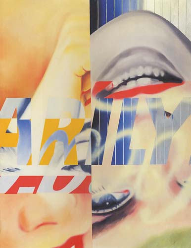
4. James Rosenquist, Marilyn Monroe
This is another piece that I really like from James Rosenquist. Obviously, this piece about Marilyn Monroe and I really like the way he presented this famous actress. He had broken down the painting into four different parts, and each par includes a really big close up from Marilyn Monroe's eyes, nose, mouth and hand. With different texts of writing Marilyn Monroe (which are in different background and colors as well) in the middle, they made this is art work looks way more exciting than with just painting a Marilyn Monroe's portrait on
5. Robert Rauschenbergs, Combines(1953-1964)
This work interests me because of its mixing of materials. It includes an object in the middle and a painting underneath it. There are paints on the sheep(the object) which creates an effect that it seems there is a relationship between the painting and the sheep. And viewers need to find out their own answers with the images, colours that had used in the painting. This makes me think this is an interesting piece which inspire people to think whats more behind this art work.


